Euro 2024 is just around the corner and with it comes a sartorial smorgasbord that we can enjoy or be deeply offended by.
What has Croatia done this time? Has England brought a real gem to the market? Why does Belgium wear brown shorts? And which kit won our coveted first place?
There are still a few shirts to be released from Puma, Macron and the good folks at Joma, but Nike and Adidas have already dropped the bulk of their gear, so without further ado let’s get started.
From visually disturbing to visually exciting, here is our list of Euro 2024 kits, ranked and rated from worst to best:
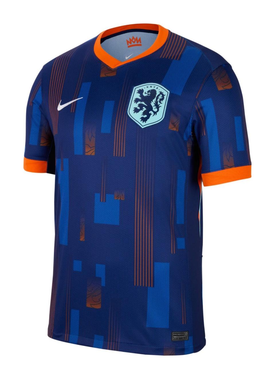
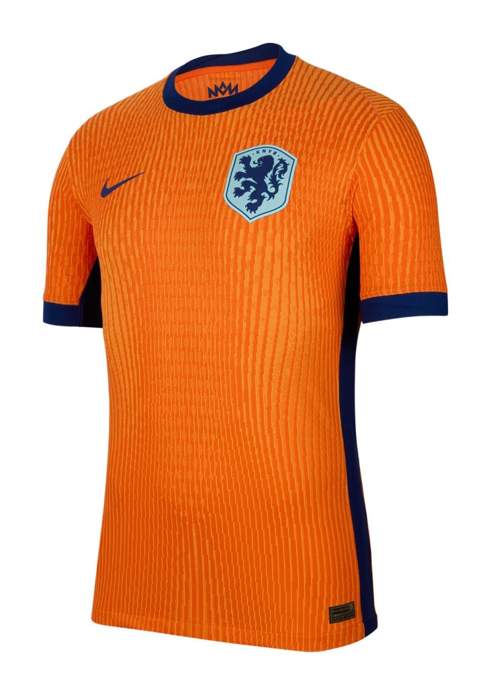
Netherlands away
This isn’t a football jersey pattern, or something people can see with their eyes if they think about it. It looks like a Travelodge carpet. We briefly wondered if it’s so bad that it’s actually good, but unfortunately that’s not the case.
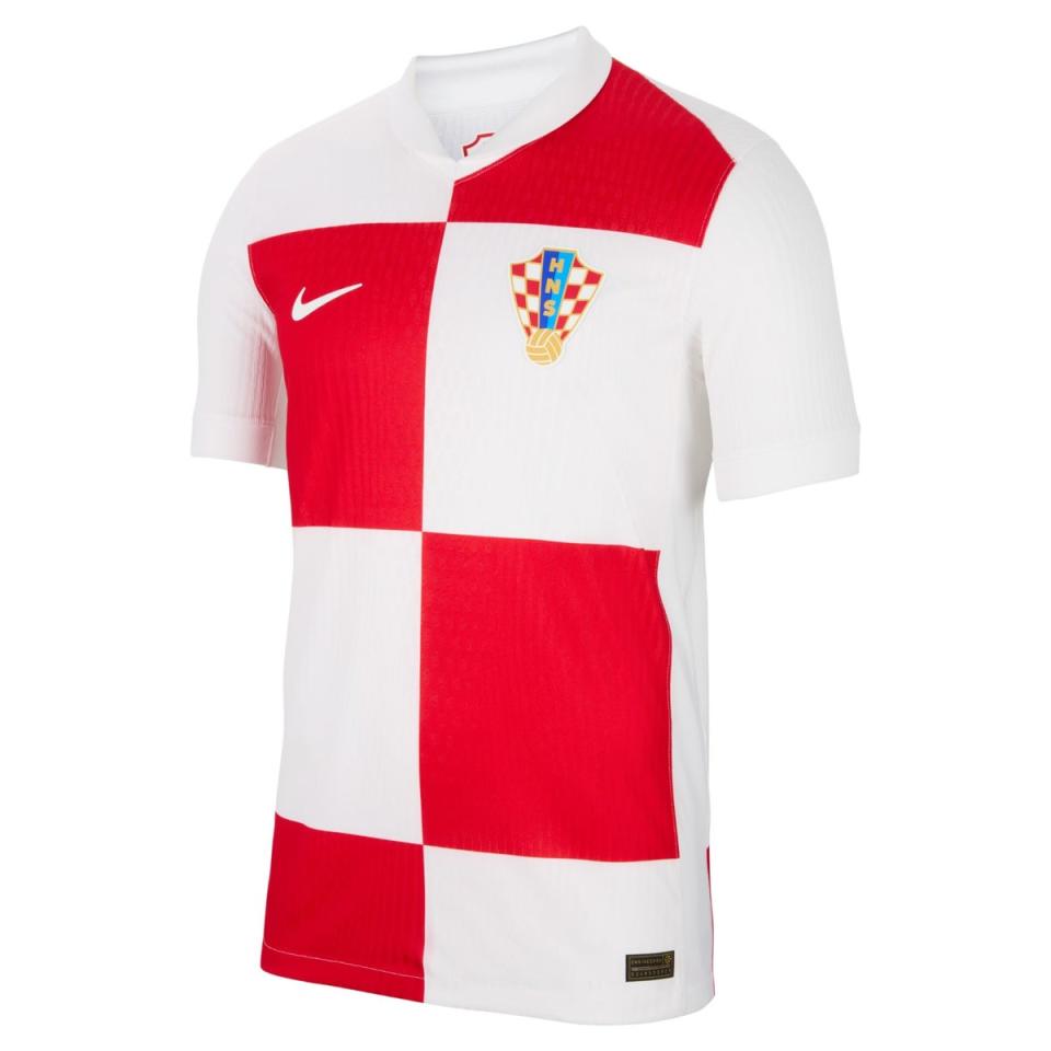
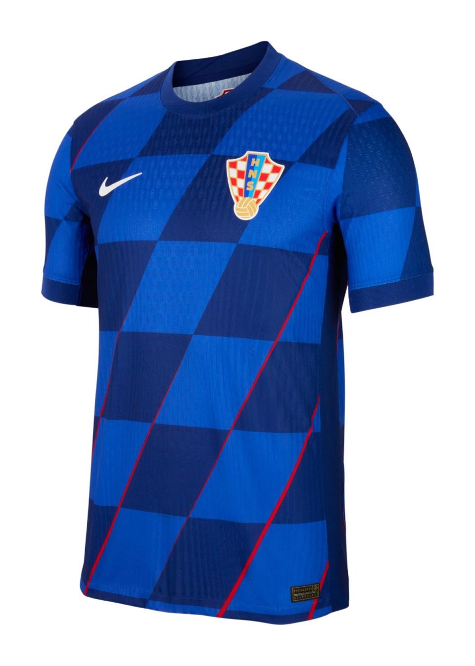
Croatia at home
Oh dear, oh dear, oh dear. Croatia at home is not difficult, folks: lots of little red and white checks! This is now two tournaments in a row where they have missed the assignment and it is not melodramatic to say that the summer has been ruined.
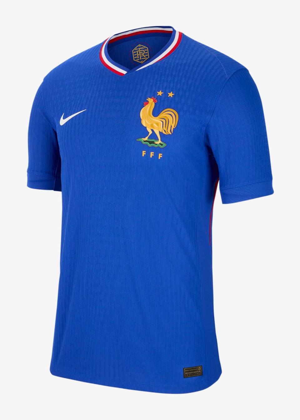
France at home
This kit has gotten a lot of love on social media, but we’re just going to say it [takes deep breath] – it’s all wrong. France has gone from the deep, darker blue back to royal blue and it’s just not as threatening. This is supposed to be a nod to the kits of the sixties, but the real retro shirts are always better than their modern imitations. The lack of symmetry in the collar gives us chills, and don’t get us started on the comically sized rooster…
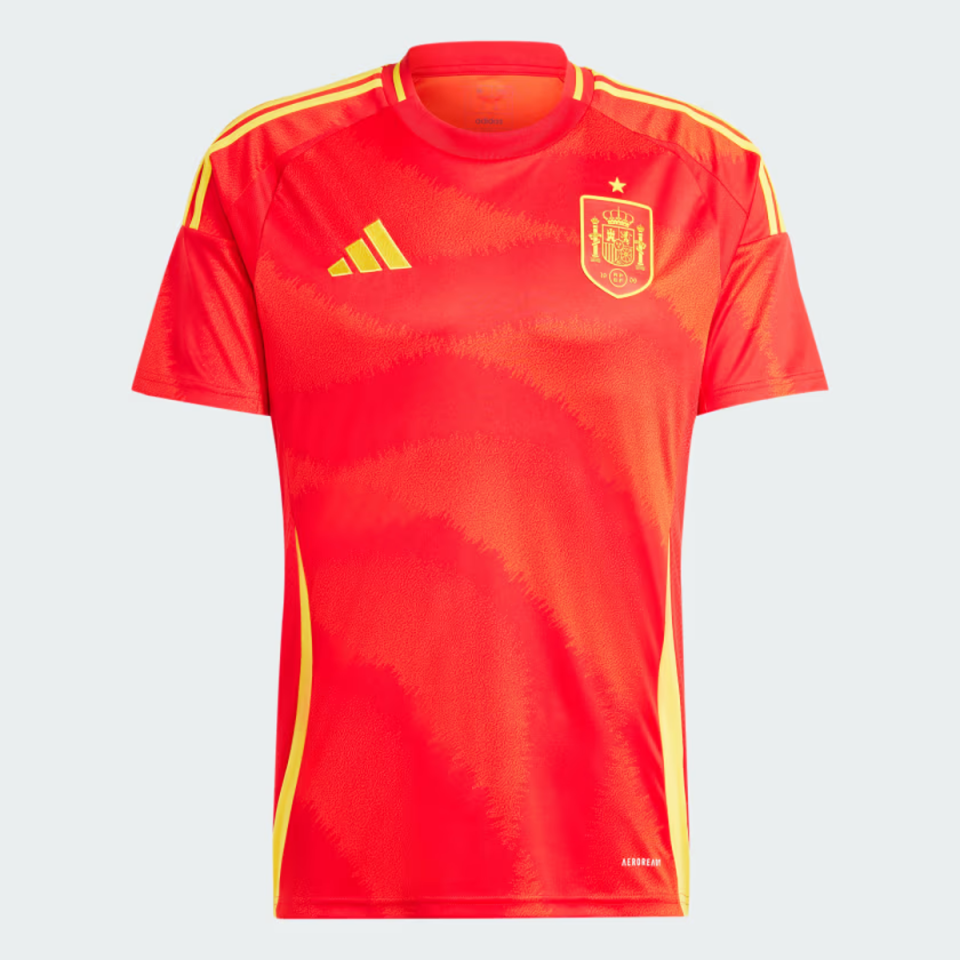
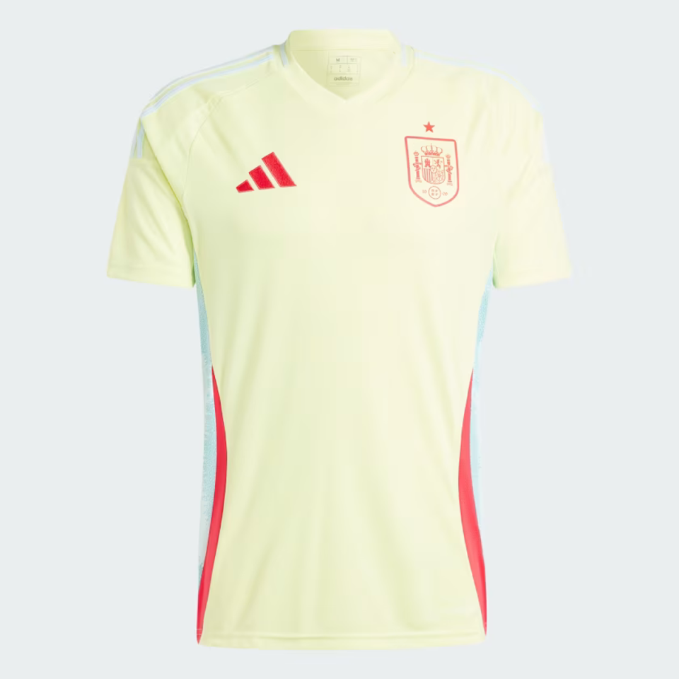
Spain at home
Is this Spanish red? IS THE?! No. It tends towards Dutch orange. Take it away.
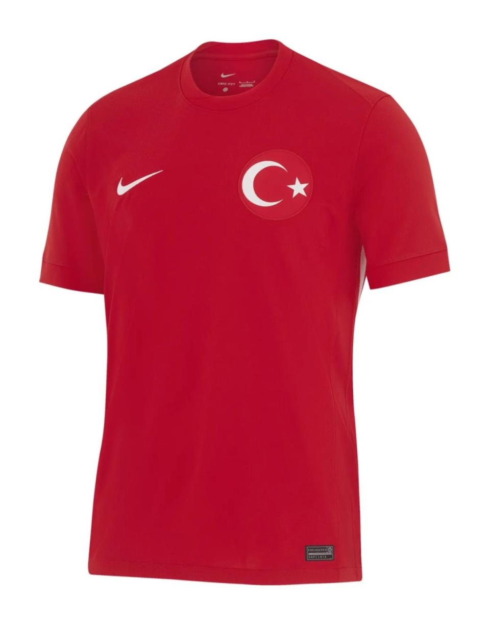
Turkey away
Harmless, but a bit simplistic. Next one.
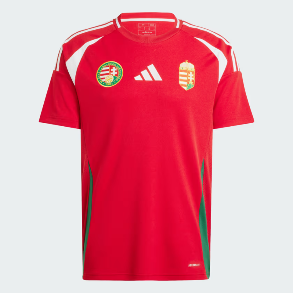
Hungary at home
Bright. Too bright? We go on.
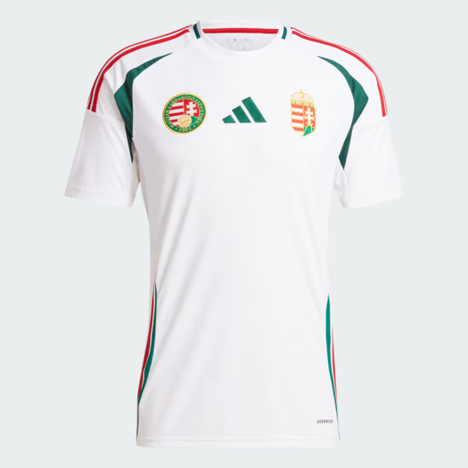
Hungary away
Nice. No further comment.
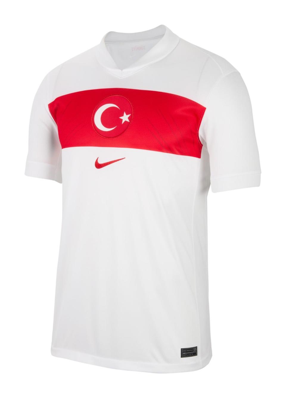
Turkey at home
What we call the ‘horizontal sash’ is very nice, but otherwise this shirt is a bit bare.
Spain away
The color is almost spoiled and would look very bad on a sickly pale person [looks in mirror and winces], although you just know Alvaro Morata is going to look handsome, mysterious and vulnerable when he misses one-on-one in this thing.
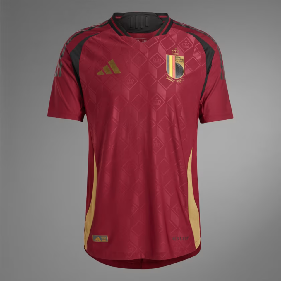
Belgium at home
The black lines around the shoulder and armpit give this a slight ‘bought shirt from prosoccerUK to play five-a-side’ energy, but the subtle diamond background keeps it from being a flop.
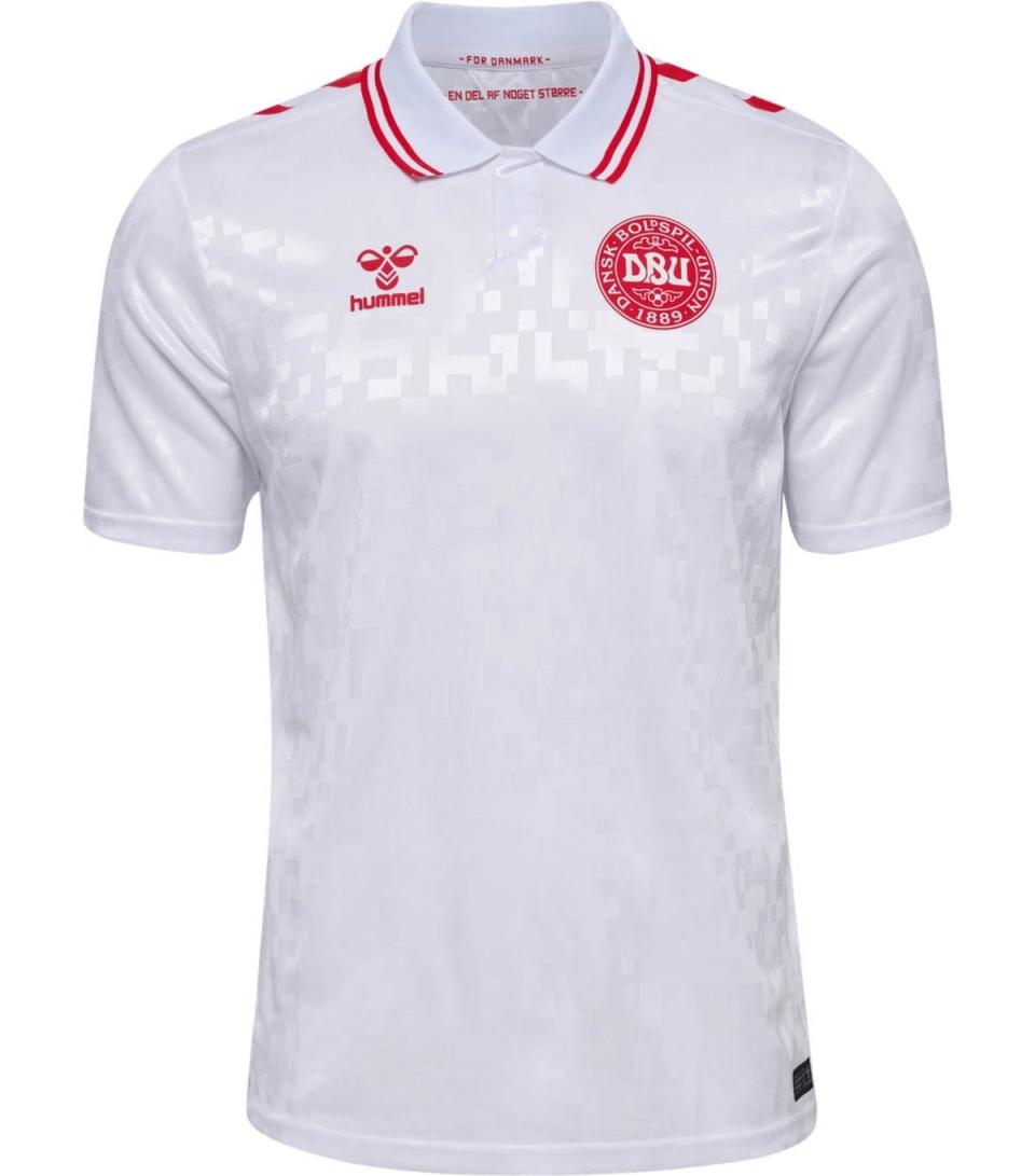
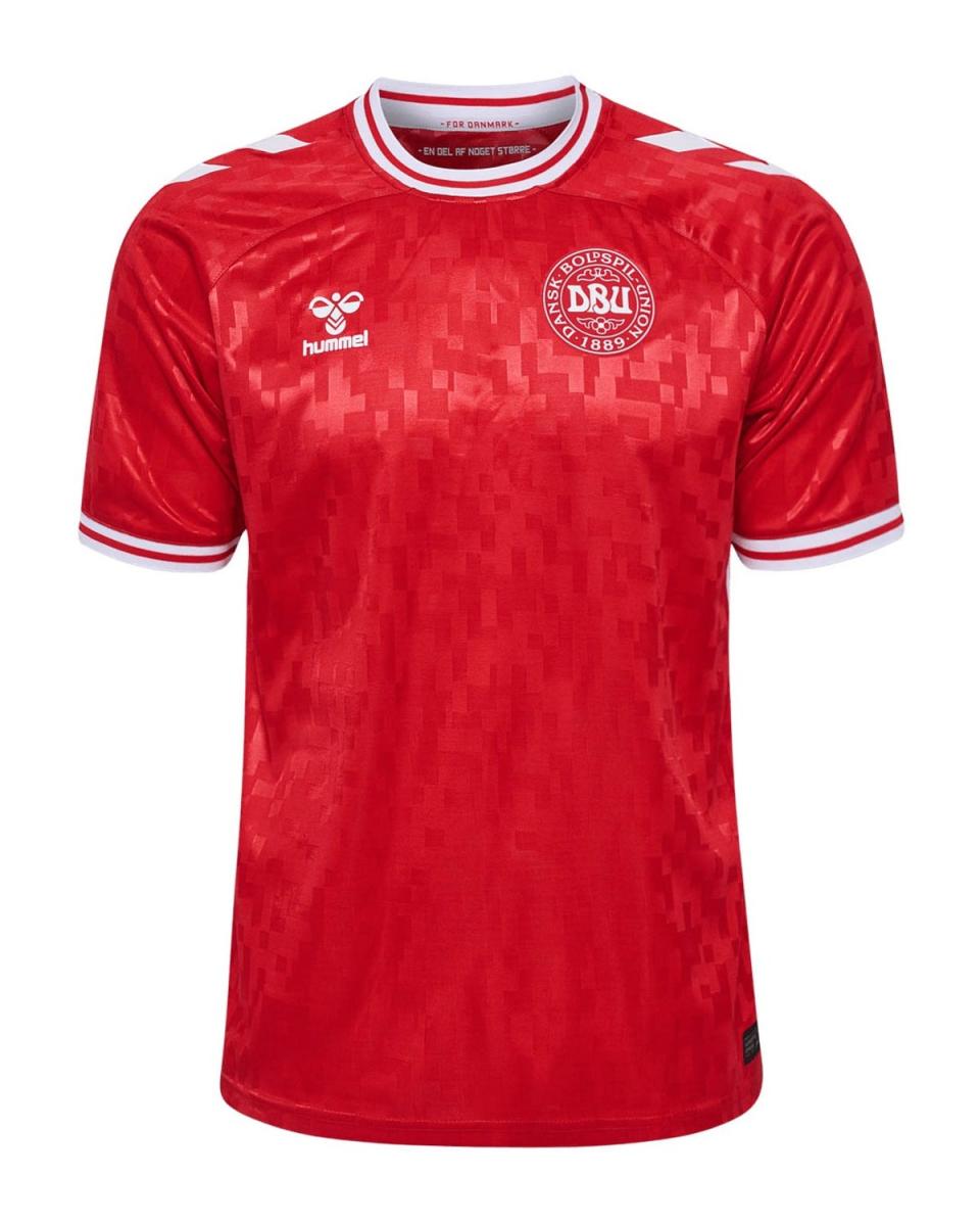
Denmark away
The collar is a nice touch that sets it apart from the home version, which will be discussed later, but a few more red accents would have taken this to the next level.
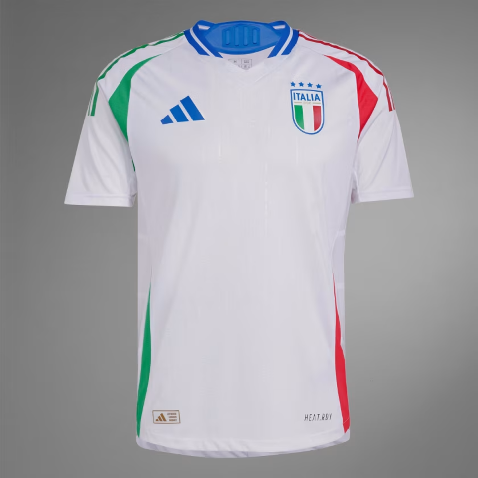
Italy away
Despite the relatively simple design, there is a lot to experience with the different colors. However, it’s all kind of coming together, and we approve.
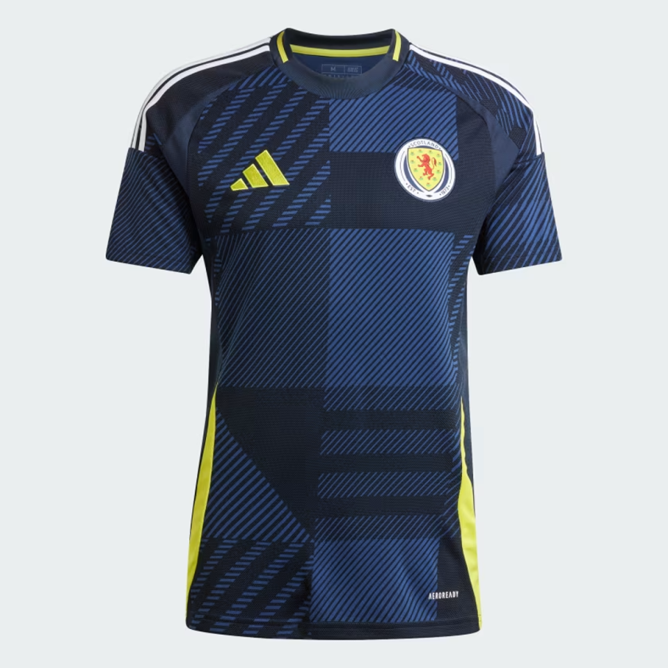
Scotland at home
Great colors and the bold background pattern are fascinating. It would be a nice curtain at Center Parcs. There’s also a faint hint of Euro ’96 here, which reminds us of Colin Hendry’s wavy locks, and that’s nice.
Croatia away
Diagonal checks? Neat. Red laser lines? Fascinating. We couldn’t stay mad at you for long, Croatia.
Netherlands at home
Lots of clean fun from Nike here, and a big improvement over the garish orange hue seen at the Qatar World Cup. The faint streaks are unusual but acceptable.
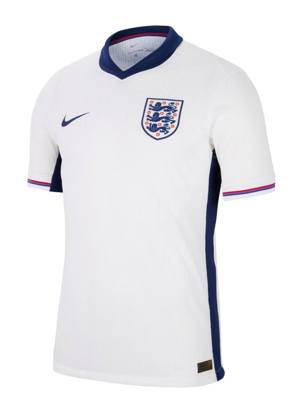
England at home
The wacky St George’s Cross made the right people angry, but the power of this shirt actually lies in the red and blue sleeve trim – a nice detail.
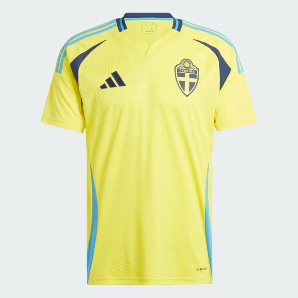
Sweden at home
This isn’t traditional Swedish yellow, which makes us uneasy, but the two-tone blue finish saves this kit from potential disaster. A nice variation on a classic. Mycket bra.
Belgium away
There are three elements we need to cover here. The first is the fact that this kit is based on the Belgian cartoon character Tintin, which is a slightly crazy but quite fun idea. The second is that the shorts are quite ugly brown because they are based on the Belgian cartoon character Tintin. The third is to consider the shirt in itself, which looks nice. We can’t help but think that Kevin De Bruyne’s international legacy deserves more than a new suit, but overall we like it.

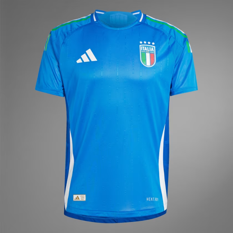
Italy at home
You can’t quite see it here, but the shoulder padding is made up of narrow lines of red, white and green and they look nice, although, as with many of this year’s kits, the shade is a little lighter than traditional. Andrea Pirlo could make this shirt look really cool, but unfortunately he’s not here, so it’s just “nice in general”. Frankly, Italy faces an uphill battle every time as nothing will ever touch their ’94 shirt and the iconic sight of Roberto Baggio’s ponytail flowing over his collar. Busy days.
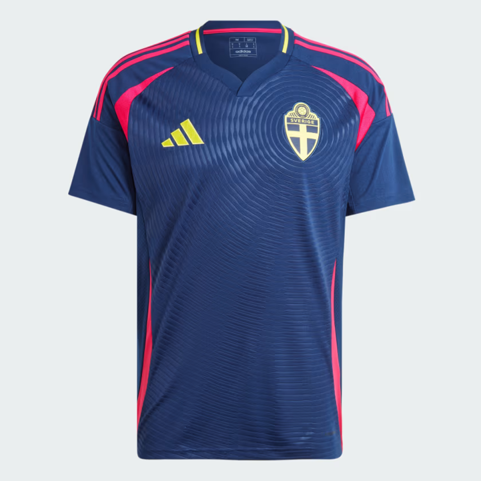
Sweden away
The pink dashes are not traditional Swedish dishes, but they work well here. The Swedes enter the round of 16 and look pretty neat.
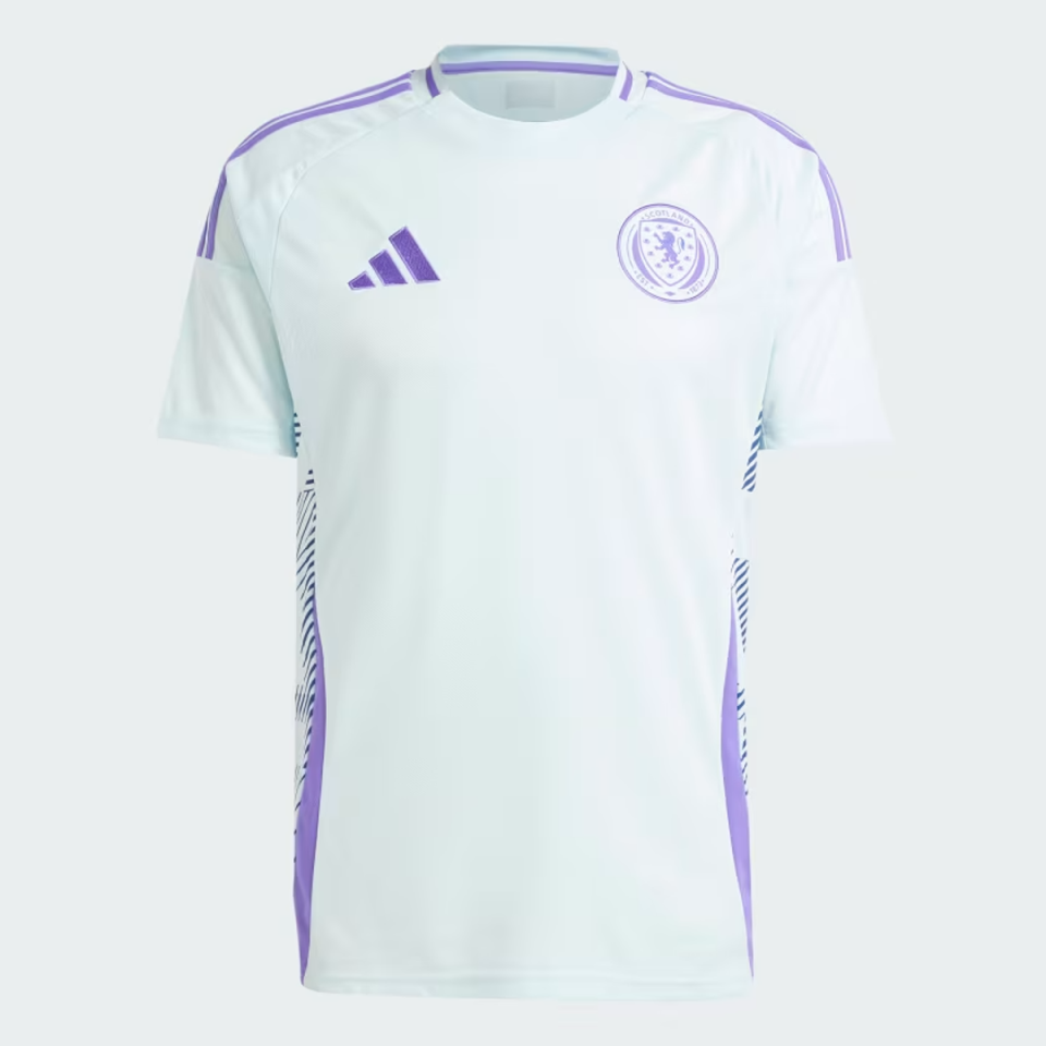
Scotland away
The purple is attractive, as are the fruity patterns along the sides. Very good.
Germany at home
This is reminiscent of the classic German shirt from 1994, where Jurgen Klinsmann looked absolutely divine with those red, yellow and black shoulders. We could do without the fading pattern, but still England will almost certainly lose to this thing in a gutsy semi-final.

Denmark at home
Hummel are maestros and they make no mistake here by scoring the right points with this glittering shirt. Christian Eriksen will look fantastic hitting the first man from a corner wearing this little number.
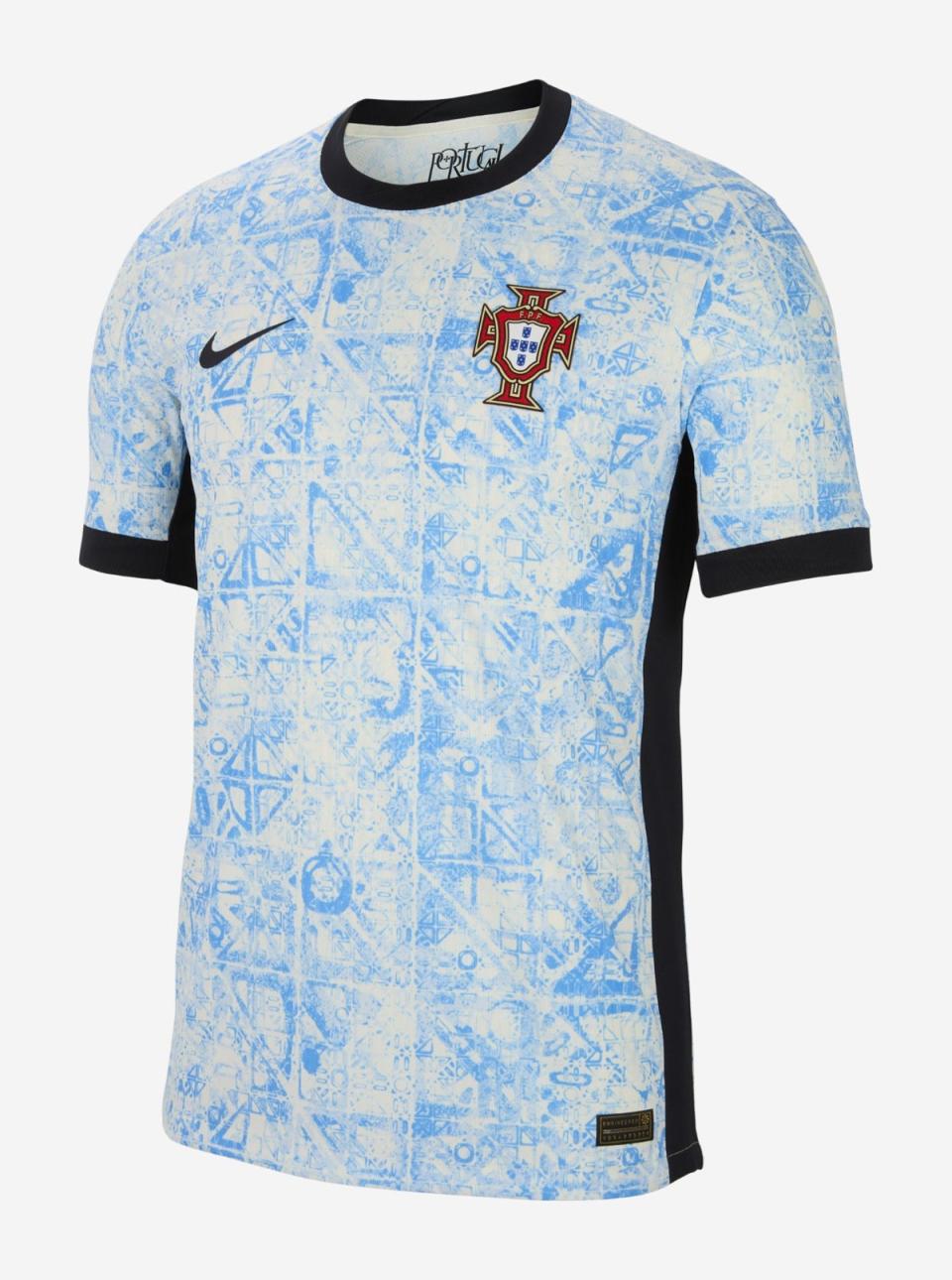
Portugal away
This kit is inspired by the characteristic azulejo tiles, Nike says, which can be found everywhere in the country. It’s natty and we like it.
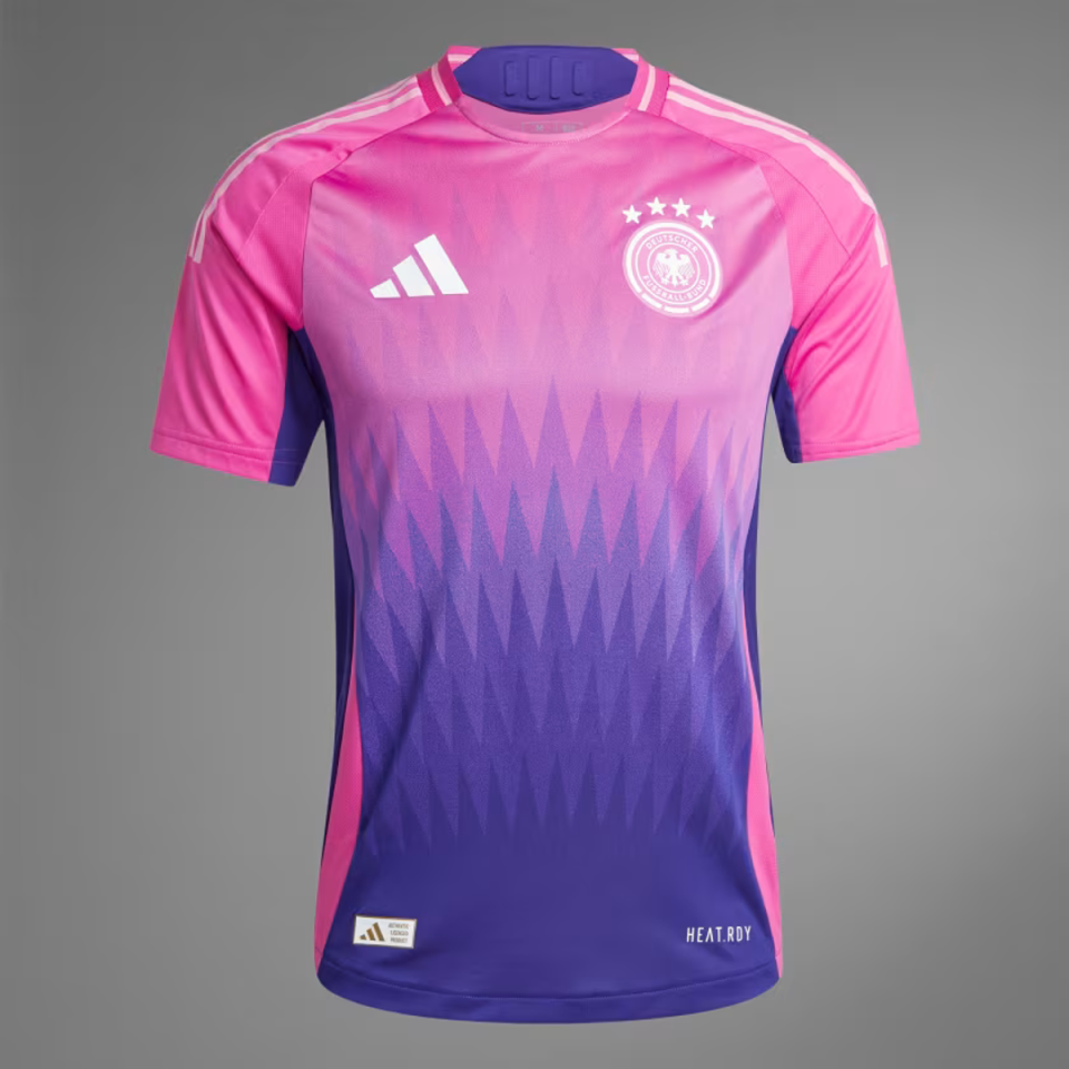
Germany gone
We’ve been staring at this for a while. It’s… quite something. The design is jazzy, the collar is funky and the colors are very cool. Toni Kroos will make this look great.
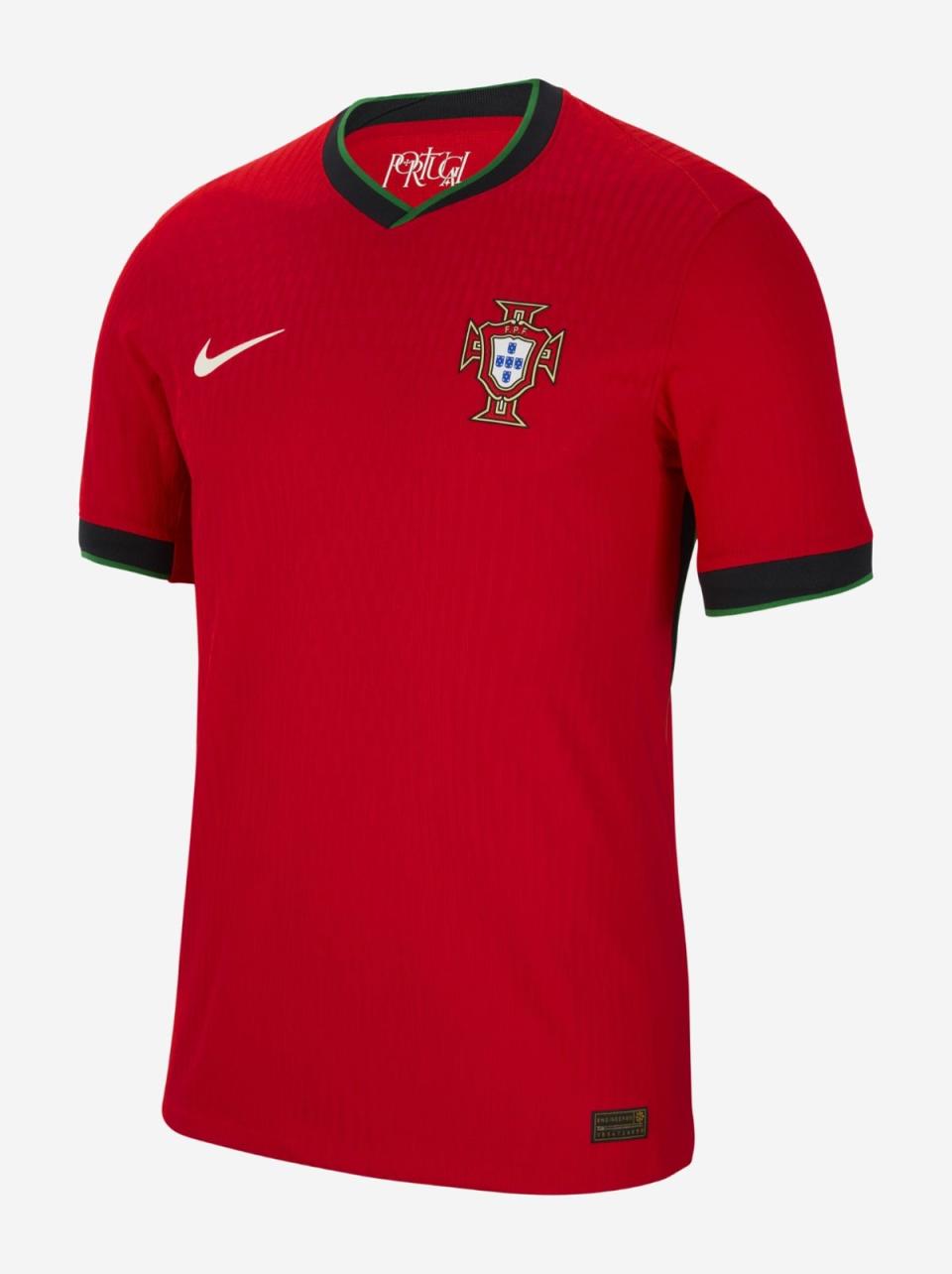
Portugal at home
The beautiful Portuguese home colors do a lot of the hard work here and so Nike have rightly chosen to keep things simple. The green stripes on the collar and sleeves are a lovely touch. It has an almost royal quality. Also an elite weapon.
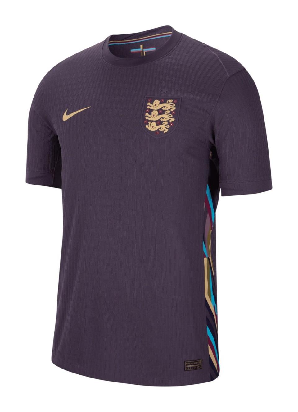
England away
England’s away editions are reliably better than their home games, but if you had told us that England’s away kit for Euro 2024 would be purple with multi-coloured side panels, we would have raised a concerned eyebrow and noticed a space at the bottom of the away shirt have cut out. this list. But good lord, what a shirt this is. The color is almost intimidating. The gold details in the Nike swoosh and Three Lions badge are rich and dreamy. Simplicity is art itself. If you could marry a football shirt…
France away
You know all those mean things we said about the France home shirt? Well, none of them apply here. Pinstripes are a risky proposition on a football kit, but this is an elegant finish, with a sharp blue border that offsets the white background beautifully. The enormous rooster is somehow less gimmicky than the home jersey, perhaps because it fits the baseball aesthetic. It’s New York Yankees and Les Bleus. It’s Lou Gehrig and Antoine Dupont. Which shouldn’t work, but somehow it does. Kapeau.
